


A detailed guide related to the CSS Flexbox (Part 1).
Here is a structured outline of a complete guide to CSS Flexbox | 2023,
Structured Outline ...
About, the Introduction
About, why Choose it?
About, the Use Cases
About, what it Contains?
About, the Flexbox properties
A CSS layout that provides an easy and clean way to arrange items within a container. It is responsive and mobile-friendly.
Positioning child elements is much easier.
About, the Introduction
CSS3 Flexible boxes also known as CSS Flexbox, is a new layout mode in CSS3.
The CSS3 flexbox is used to make the elements behave predictably when they are used with different screen sizes and different display devices. It provides a more efficient way to layout, aligns and distribute space among items in the container.
It is mainly used to make CSS3 capable to change its item's width and height to best fit all available spaces. It is preferred over the block model. Before the Flexbox Layout module, there were four layout modes and here they are ...
Block, for sections in a webpage
Inline, for text
Table, for two-dimensional table data
Positioned, for the explicit position of an element.
About, why Choose it?
Here are the key points to consider before choosing it:
It allows the collection of items in one direction or another.
It controls the dimensions of the items or control the spacing between them.
About, the Use Cases
The use cases of CSS Flexbox are:
Navigation
Card layout
Footer
Media objects
Form controls
About, what it Contains?
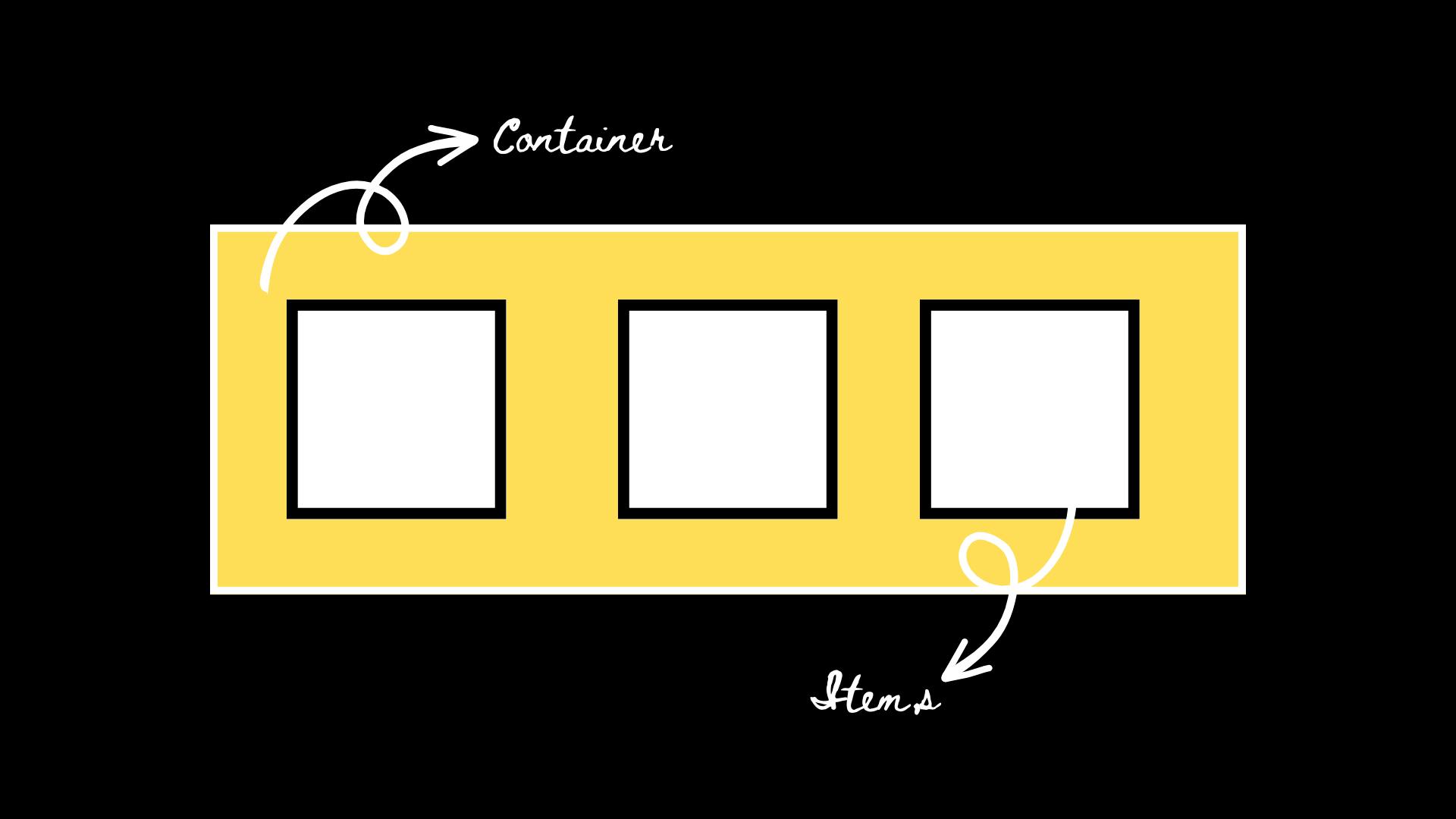
The CSS3 flexbox contains flex containers and flex items.
Flex container: The flex container specifies the properties of the parent. It is declared by setting the display property of an element to either flex or inline-flex.
Flex items: The flex items specify the properties of the children. There may be one or more flex items inside a flex container.
About, the Flexbox properties
Here are the most used properties:
| display | It is used to specify the type of box used for an HTML element. |
| flex-direction | it is used to specify the direction of the flexible items inside a flex container. |
| justify-content | it is used to align the flex items horizontally when the items do not use all available space on the main axis. |
| align-items | it is used to align the flex items vertically when the items do not use all available space on the cross-axis. |
| flex-wrap | it specifies whether the flex items should wrap or not if there is not enough room for them on one flex line. |
| align-content | it is used to modify the behaviour of the flex-wrap property. it is similar to aligning items, but instead of aligning flex items, it aligns flex lines. |
| flex-flow | it specifies a shorthand property for flex-direction and flex-wrap. |
| order | it specifies the order of a flexible item relative to the rest of the flex items inside the same container. |
| align-self | it is used on flex items. it overrides the container's align-items property. |
| flex | it specifies the length of a flex item, relative to the rest of the flex items inside the same container. |
👉Refer to more details here & here ...
🔗 Social Links (Let's connect):
▶ Instagram: instagram.com/ahangar_aadil?u...▶ LinkedIn: linkedin.com/in/ahangaraa...▶ Telegram: t.me/ahangaraadil
▶ Facebook: facebook.com/ahangaraadil...📌Resume aka CV (ongoing ...)
▶ Google Drive Link: drive.google.com/file/d/15QBZfoyvXzwGJoIn9c..link